
7 Easy Steps to Not-Bad Slide Decks
We’ve all been there: at a presentation, ready to take notes, eager for the speaker’s illuminating insights. After their introduction, they open their PowerPoint, and
oh
no.
Suddenly you’re confronted by three paragraphs crammed onto one slide, then a graph with 50 shades of neon, then a pixelated photo with a stock watermark, and on and on until it feels like your eyes might bleed. Or maybe you were on the other end, anxious about presenting but pleased with your data-heavy slides, only to notice everyone staring in horror at the 14-column table you spent so long perfecting.
But it doesn’t have to be that way.
Slide presentations can be enormously impactful and educational. And you don’t need to spend hours researching PowerPoint tips: strong slides stem from honed ideas and clear communication, not fancy animations and custom colors.
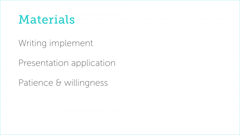
You will need:
Your writing implement of choice
A presentation application, such as PowerPoint or Google Slides
Patience and willingness to start from scratch
Step 1
Back away from the computer
Get your writing implement of choice and and figure out the following in this order, inspired by Simon Sinek’s Golden Circle:
Who?
Who is your audience? A conference room of doctors differs considerably from a classroom of middle schoolers, and your approach will likewise differ.
Why?
Why should the audience care about your presentation? Why do you care? In other words, what’s your purpose?
How?
How will you get your messages across? How will you keep the audience’s attention?
What?
What will you put on your slides to get those messages across?
Step 2
Figure out your flow
Now that you have a sense of your messaging, what about the order and content?
List or sketch your presentation’s themes and flow
Sticky notes and index cards can be especially useful since you can easily reorder them.
Use hooks to draw the audience in
Anecdotes, human interest stories, bold statements, stark facts, and interactive exercises will grab your audience members’ attention. Space such hooks at regular intervals throughout the rest of your presentation to keep them engaged.
Don’t lose track of the big picture
Keep your broad messages in mind as you delve into specifics. Will your audience care about that complicated formula for processing data points, or will they get more from a surface-level explanation?
Step 3
Return to your computer and start a new presentation
Yes, from scratch, even if you planned on recycling content from another deck. If you need to use a custom master template (your company’s slide format, for instance), now’s the time to make a deck directly from such a templated file, or load a theme if one is available.
Step 4
Write your content, but not much


It’s tempting to stick multiple sentences onto each slide, but don’t. Slides are a supplement to your presentation, not the whole thing, and it’s great when a slide consists of a brief blurb, phrase, or even single word.
People are awful at multitasking, and they will absorb information better if the slide’s content reinforces your speech instead of competing with it. Simple, limited content focuses your audience on what you’re saying instead of on a barrage of bulleted items. Tiny, easy-to-recall bits of text will trigger memories for them later on, as well.
Your slide count will likely increase, and that’s okay, too: numerous purposeful, engaging slides will feel lighter and quicker than a few bogged down by overwhelming amounts of content.
Step 5
Include simple graphics


Huge emphasis on simple. (You may notice a trend.) Similar to minimal text, large icons and photographs will grab attention and stick in your audience members’ minds while supporting your spoken words.
Likewise, design graphs for ease of understanding and avoid any superficial features like 3D effects and drop shadows. Keep labels close to whatever they’re labeling. And when in doubt, standard and stacked bar graphs are the way to go.
Step 6
If you can’t go simple, go low-tech

If you find that your messaging truly relies on complicated tables and in-depth flowcharts, cut them anyway — and paste them into a different document. Set up and print a one- or two-page handout to accompany your presentation. Think of it like appendices or footnotes that your audience can absorb at their own pace.
Step 7
Ruthlessly declutter your slides
Cycle through your slides, paying attention to their visual impact and how they make you feel. Take a cue from Marie Kondo: do those slide fade-ins spark joy? Of course not, nobody likes transition animations; delete them. Pixelated clipart? Gone. Sound effects? Absolutely not. Clutter makes your presentation look dated and distracts your audience.
Congratulations, you’ve finished! Go forth and practice, and further hone your slides if they aren’t quite there yet.
(And seriously, ditch those animations.)